How to Update a Craftsman Kitchen on a Budget....
I recently had a friend write to me about a dilemma with her craftsman bungalow kitchen. She feels the dark, heavy wood is overtaking the space and she wants to refresh and make current without ripping everything out and starting over.
I think a lot of us can relate. How can we update and refresh without taking out another mortgage on our house? If the cabinetry is functional, updated-ish and in good condition, why get rid of it? There's LOTS you can do to refresh and brighten up a kitchen without completely starting over.
Here are the photos she sent me of her kitchen.
And here are my thoughts...
She asked about repainting the kitchen island white. I would not for two reasons - One, this is not a lazy Sunday project. Sanding and prepping and painting cabinetry takes a lot of expertise. And two, a white island in the middle of all of this dark wood would not look very fluid. (Oh, and three, the cabinetry finish is really not BAD at all).
Here's what I would do, if this were my kitchen:
<< 1 >> Update backsplash
Changing out the backsplash is one of the biggest bangs you can get for your buck. The look of new tile goes a long way. And did you know you could buy tile from discounted sites like overstock and wayfair (and it's perfectly good)? In this case, I would recommend she spend the couple hundred bucks (if that) on tile and find a good tile installer for another couple hundred and call it a day.
Check out this selection from Wayfair (and the price!). The color, small scale, and bit of rust on the edging compliments the cabinetry very well and will brighten up the space considerably.
<< 2 >> Switch out pulls on cabinet doors
It looks like she could get away with switching out only pulls and leaving knobs as is. This classic style from RH is much sleeker. Be sure to measure for the correct size.
<< 2 >> New rug
I would definitely switch out the rug for something a little more modern and fresh like this Target rug. The grays will neutralize the browns and the blues pick up on the backsplash. Since I've only seen photos and not measured the kitchen, just a side note, be sure to measure the space and choose the appropriate size - bigger is better.
<< 3 >> Paint
Because of the intense brown tones, I would choose my go-to greige for this space, Benjamin Moore's Revere Pewter. This is the ultimate neutralizer - it can go gray, it can go beige. Really, it just kind of goes away. It's lovely, fresh, and clean.
<< 4 >> Switch out pendant
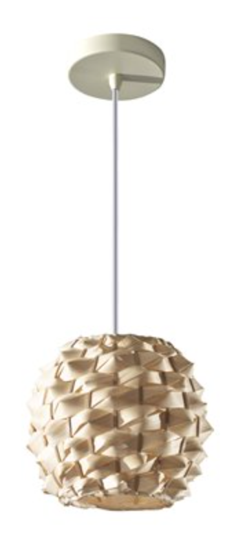
Changing out lighting is often thought of as very labor intensive but it's actually quite easy, and not that expensive to do. I love this bamboo pendant for something fun and textural, and goes well with countertops.
<< 5 >>
New counter stools
I would go with something upholstered to bring in some softness and give the eye a rest from all of the darker toned wood on floors and cabinetry. This one from OKL would work well.
<< 6 >> Large scale artwork
Artwork is a tough one, but this large wall needs something bigger for sure.
I like the combination of theses prints from Society 6 - the avocados and the cooking utensils. I would do the vector white frame, as shown, in the largest size, 26" X 38", hung horizontally as pictured below. This will fill up that wall nicely and bring some brightness.
Lastly, I would put a potted herb garden or succulents on the window sill. It's the details!
I hope this gives some inspiration for where you might be stuck in an outdated look. There is plenty to do to brighten up and refresh, working with what you've got.
xx
Anna


